
Sila Chteniya. Version 2
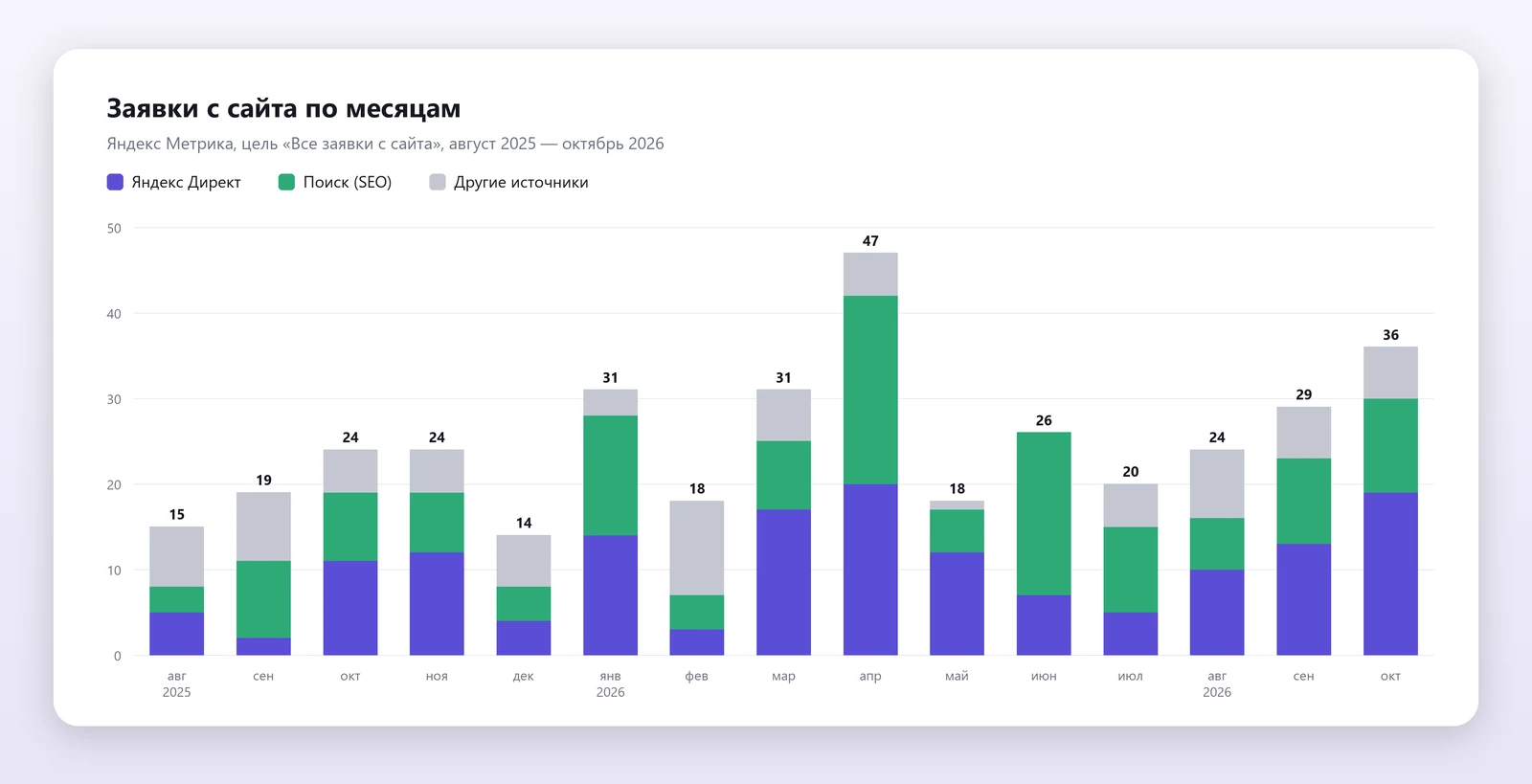
The second version of a speed-reading school's site: a landing page for every age and every pain point, a free assessment as the first step, student stories and 3D symbols. 46% more leads a month, a 1.8× higher conversion rate.
- Client
- Сила Чтения
- Year
- 2026
- Website
- Visit the website ↗
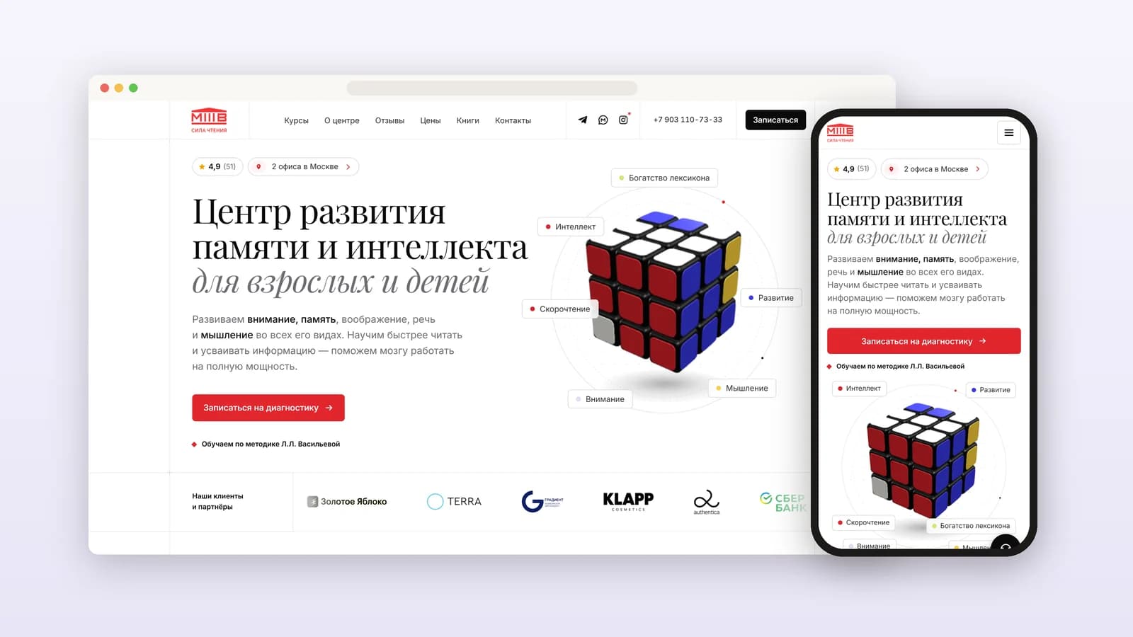
We've worked with the Sila Chteniya speed-reading school since 2019. The first version of the site was on Tilda, and SEO and ads started there. The second version is built around marketing: every client gets their own page, their own offer and a short path to sign up.
Results
The challenge
The school grew: two offices in Moscow, 11 programmes, students from 4 to 70+. Each audience has its own pain. A preschooler's parent fears the child isn't ready for school. A third-grader's mum is tired of homework in tears. A manager lacks focus at work, and someone past sixty notices their memory slipping.
The first version of the site spoke to everyone at once and to no one in particular. Ads led to general pages, and people left without finding themselves there. Every visitor needed to see from the first screen: this is about me, they can help, and here is a simple first step.
Strategy: a landing page for each audience
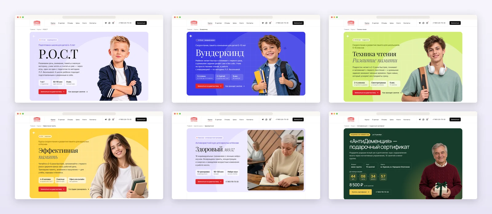
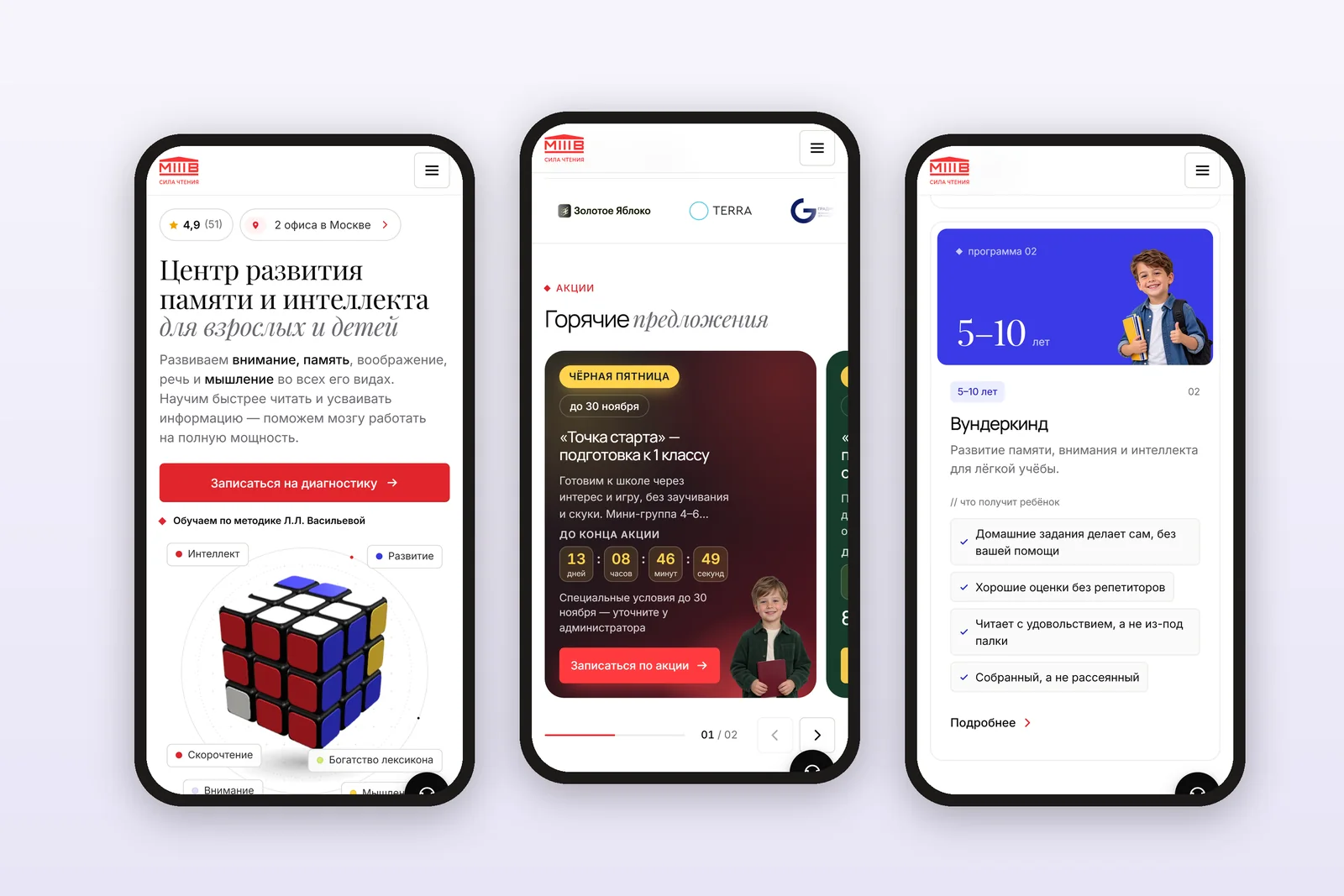
We split the audience by age and main pain point and built a separate landing page for each segment: a headline in the language of that pain, the result in numbers, the format and one-click sign-up.
| For | Pain | Landing page |
|---|---|---|
| Parents of 4–5-year-olds | The child isn't ready for school | "R.O.S.T": school readiness one on one with a teacher |
| Parents of 5–10-year-olds | Bright, but school is hard, homework in tears | "Wunderkind": reads fast and does homework alone |
| Students aged 10–14 | Lots to read, nothing sticks | "Reading technique": reads 2–3× faster, every subject speeds up |
| Adults | Not enough memory and focus at work | "Effective memory": memory and focus for career and business |
| Older people | Memory is starting to slip | "Healthy brain": 16 sessions with a personal neuro-coach |
| People giving care | I want to help my parents | "AntiDementia": a gift certificate for the course |
Five more programmes got their own pages: Russian without mistakes, calligraphy, art therapy, neuro-assessment and first-grade readiness in a mini-group. Ads send each audience to its own landing page, so people see themselves right away.
A free assessment as the first step
A course is a serious purchase, and paying for it straight away is scary. So the main button on every page is "Book an assessment": free, with no commitment. A trainer picks the programme and format, and the parent meets the teacher and the centre before paying anything.
- A quiz helps choose a programme by age and goal and leads straight to sign-up.
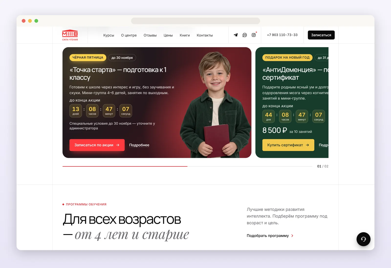
- Offers with a timer give a reason to sign up now: "Starting point" for future first-graders, an "AntiDementia" gift certificate for the holidays.
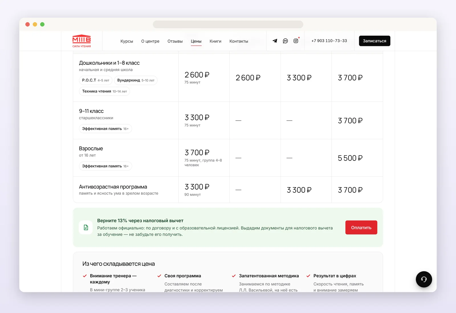
- Prices are open and on one screen, with no hidden fees: trust starts with transparency.
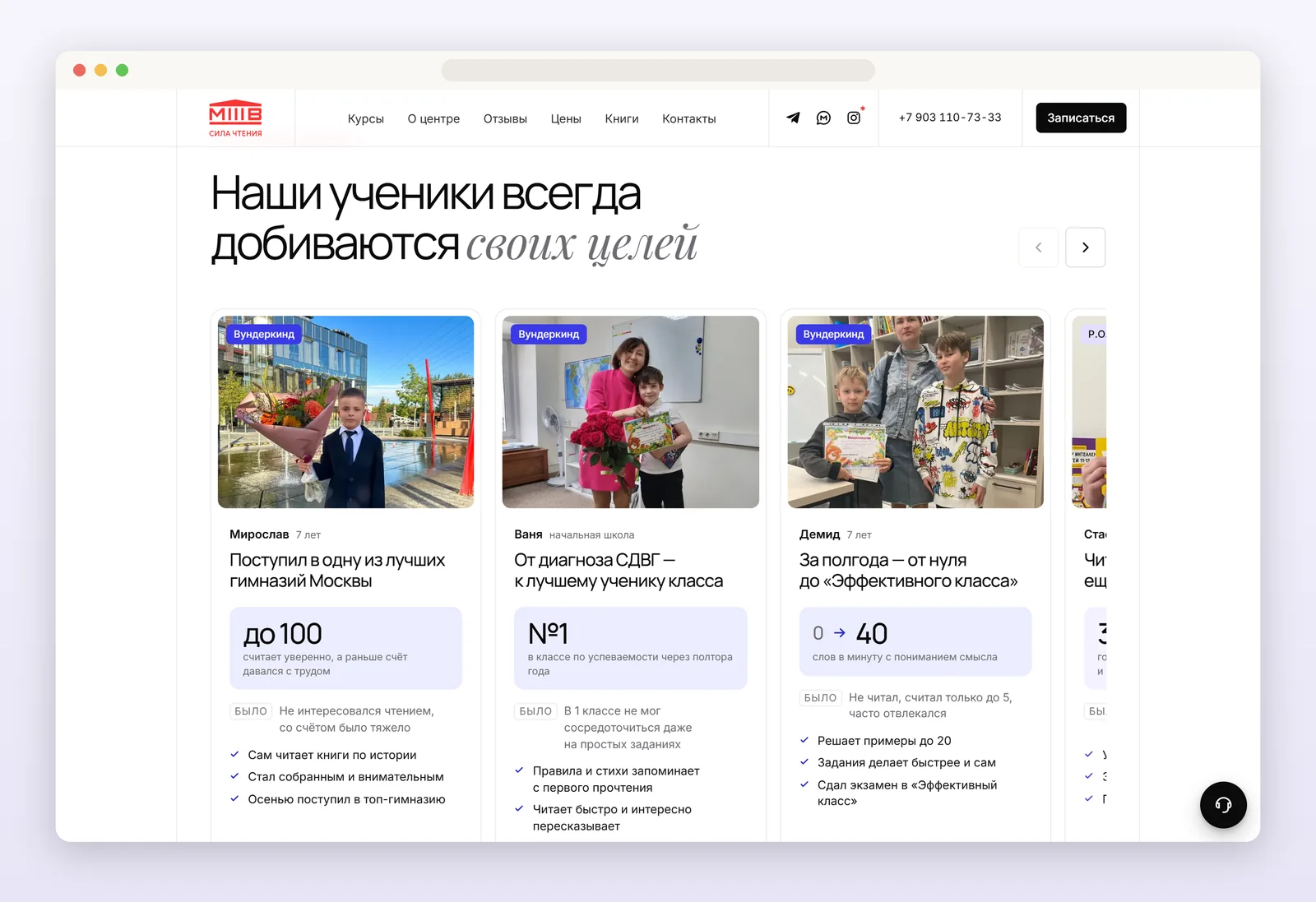
Trust: student stories and reviews
Parents need proof, not promises, that it works for children like theirs. So the site has:
- Student stories with results in numbers: where they got in, what scores they got, how grades and reading speed grew.
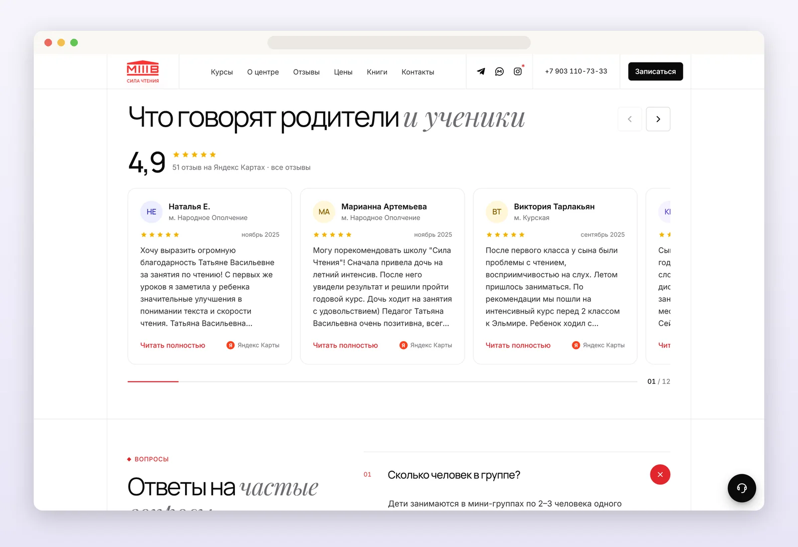
- Reviews from parents and students, with a 4.9 rating on Yandex Maps.
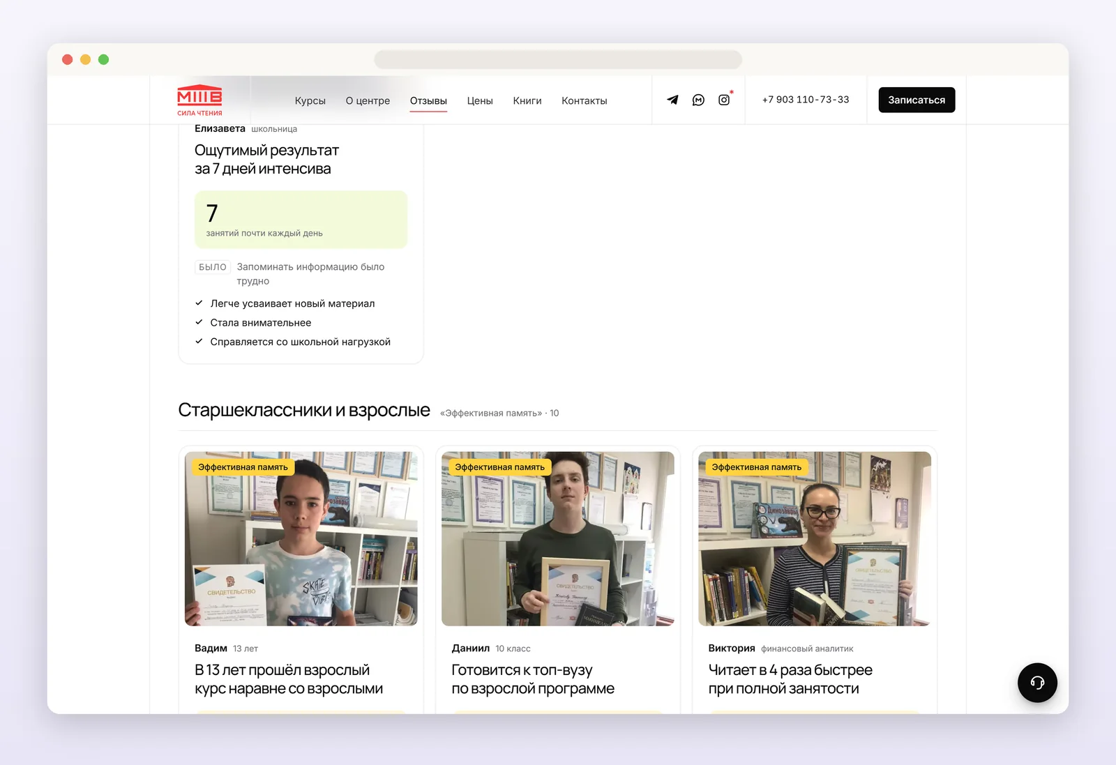
- Intensive course results in 7 days: what changes in just a week.
- L. L. Vasilyeva's patented method, trainers with photos and experience, the school's clients and partners.
3D symbols: the site's signature
To make the site memorable and set it apart from competitors, every programme has its own 3D symbol that moves right on the page:
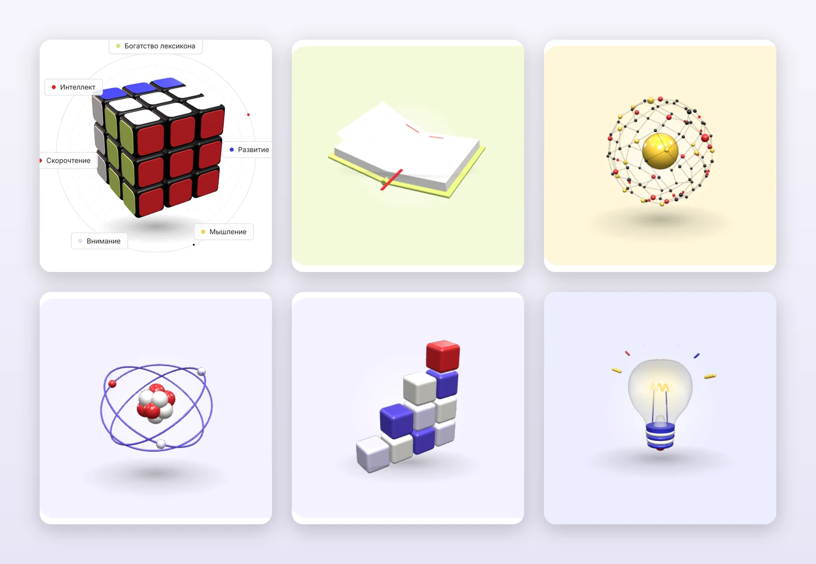
- A Rubik's cube on the home page scrambles itself, remembers the moves and solves itself back: a metaphor for memory and thinking.
- A book turns its pages on "Reading technique", a network of links lives on "Effective memory", a staircase of blocks grows on "R.O.S.T", a light bulb switches on for "Wunderkind", an atom spins on the method page.
The 3D doesn't slow the site down: three.js loads only after the visitor's first action and only on devices that can handle live graphics. Everyone else sees a polished still image.
Tracking every step
Metrica used to see only a submitted form. Now the site has about 40 events: quiz steps, every form, filling errors, QR payment, book reservations, and "quiz → lead", "assessment" and "intensive" funnels. It's clear which landing page and which ad bring leads, and where people drop off.
Yandex Direct
- Pay-for-conversion strategies on the main goal, "All leads from the site".
- Ads send each audience to its own landing page.
- Negative keywords and Advertising Network placements are cleaned regularly: homework, games, mobile apps and other sources of empty clicks are removed.
- Competitor and method keywords kept on purpose.
Its own site instead of Tilda
- Plain HTML, CSS and JavaScript with no site builder or database: faster, with no subscription.
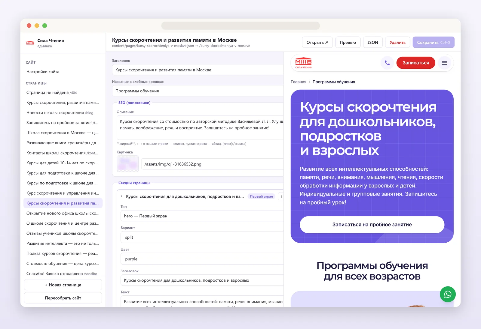
- A custom admin with a live preview: courses, teachers, reviews, offers and books edited without a developer.
- Every page address kept, so no search positions were lost; Schema.org, sitemap and Open Graph on every page.
- A UI/UX audit of 26 pages and one design system: type, buttons, cards and spacing by the same rules.
Outcome
Monthly averages, August–December 2025 against January–October 2026.
| Metric | Change |
|---|---|
| Leads from the site a month | +46% |
| Visit-to-lead conversion rate | ×1.8 |
| Leads from Yandex Direct a month | +76% |
| Leads from search a month | +76% |
Conversion grew because every visitor lands on a page about them, sees a free and simple first step, and finds proof that the school helps people like them.
Want a result like this?
Tell me about your project. I reply within 24 hours.