Case study · 2019
Dom Snovideniy
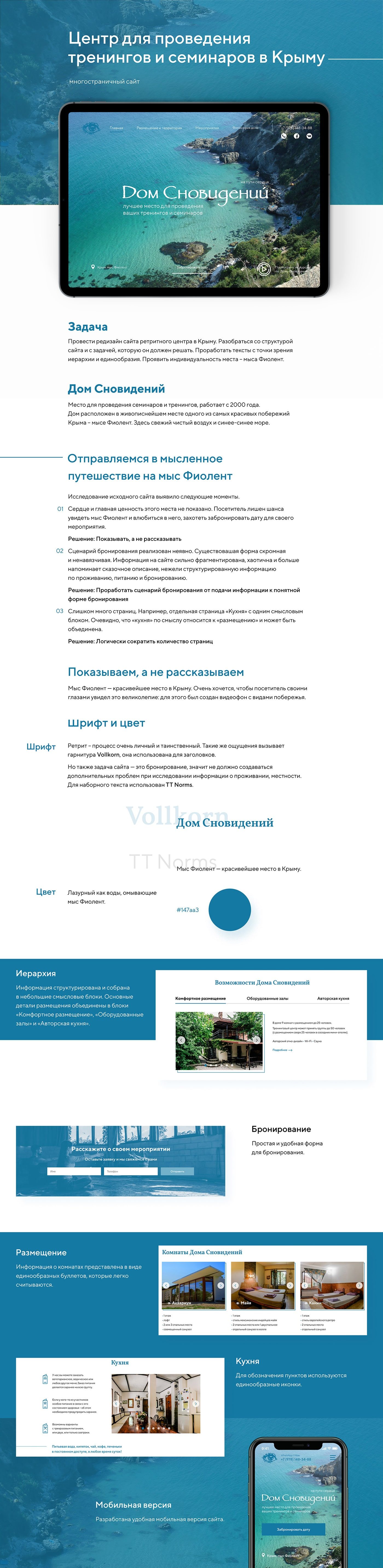
A redesign for a retreat centre in Crimea: a new structure, clear booking and video of Cape Fiolent.
- Client
- Дом Сновидений
- Year
- 2019
- Website
- Visit the website ↗
- Services
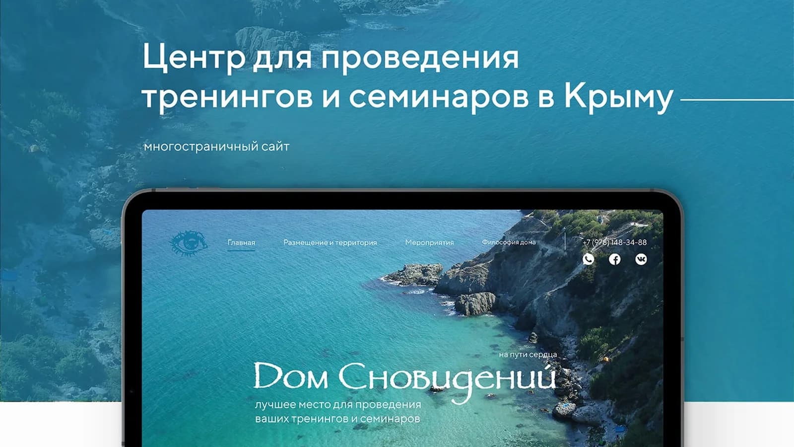
A redesign of the multi-page website for Dom Snovideniy, a training and seminar centre in Crimea. It has been running since 2000 and stands in one of the most beautiful spots on the coast, Cape Fiolent.
The task
Redesign the site: sort out its structure and the job it has to do, rework the copy for hierarchy and consistency, and bring out the character of the place.
What the old site showed
- The place's main value was not shown: visitors could not see Cape Fiolent and fall in love with it. Solution: show, don't tell.
- The booking path was hidden, and the information about staying there was scattered and read more like a story than facts. Solution: a path from rooms, food and halls to a clear booking form.
- Too many pages, such as a separate "Kitchen" page with a single block. Solution: cut the number of pages logically.
What we did
- A video background with views of the coast on the first screen, so guests see the place with their own eyes.
- Fonts: Vollkorn for headings, personal and a little mysterious like a retreat, and TT Norms for body text.
- Colour: azure like the water at Cape Fiolent (#147aa3).
- Information grouped into "Comfortable rooms", "Equipped halls" and "Signature kitchen".
- A simple booking form: the guest describes the event and the centre gets in touch.
- Rooms as identical cards with short bullet points, and the kitchen with clear icons.
- A convenient mobile version.
Project presentation